
For this design; I turned less to the art found in bestiaries to more general medieval manuscript illuminations; taking inspiration from the intricate flowing floral designs to frame my painting of a dove, enclosed in a more conventional rectangle border with a goldleaf layer inside. I used pale greens, purples, pinks and blues to compliment the colours of the dove as opposed to the more basic, bold colours usually used in medieval art; however I think this makes my design look too 'pretty', I would rather my designs to have more of a bold presence.
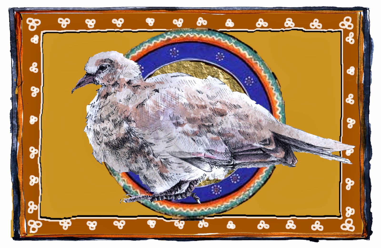
This is my revised design for my dove painting, using a design which is more blockish and bold than my previous design, with more deeper colours and more simplistic patterns to counterbalance the delicate, detailed dove.

for this design idea medieval bestiary art directly influenced the background and border; I took elements from several medieval illustration pieces and turned them around with my own ideas to create a this design. The colours are largely muted primary shades; which is very typical of this style of art. the detailed white deer in the center of the composition overlaps with the border, which is another conventional feature of medieval bestiary illustrations as the artists tend to pay no mind to perspective or to representing things realistically. The deer however would be completed in a much more fine and representative style; juxtaposing the blue and gold stylised beasts found in bestiaries. The stars, rectangle center and the square shapes in each corners will be completed in gold leaf, while the rest of the image will be watercolour (with gum arabic to create the white pattern inside the border), stick and ink for outlines and fineliner for the details.

This design broke a few of the more recognisable conventions in medieval art; the colour combination for example are fairly atypical in this style of art (muted primary colours with golds and browns are more conventional). I based by colour choices on the fur of the fox; not wandering far from harmonious red, browns and golds - contrasted with bright turquoise. As with all my designs; I'm combining the bright, stylised technique of medieval art with a painting of a much more realistic representation of an animal. The gold areas in the leaves of the tree and the squares in each corner will be completed in gold leaf. The rest of the image will be completed in watercolour, stick and ink for outlines and fineliner for details.


I chose to design my front cover digitally, as opposed to painting it traditionally, as I think this will give my book a more professional, sleek appearance. This also allows me to glaze the cover without worrying about the paint bleeding or smudging.
No comments:
Post a Comment